

How Roshambo Boosted Revenue Per Visitor by 36.13% with Targeted UX Experiments
+29.31%
Rise in Conversion Rate
+36.13%
Increase in Revenue Per Visitor
Overview
Roshambo is an e-commerce brand specializing in stylish, durable eyewear for babies, kids, and adults. With a strong focus on functionality, safety and design, the brand caters primarily to parents looking for reliable yet fashionable eyewear solutions for their children.
Insights from data
Using CrowAI’s Analytics module, the team was able to discover that Roshambo’s customer funnel faced friction at 2 key stages - product discovery and decision-making stages. Further analysis revealed the following insights:
Navigational friction: Users had to scroll through large banners and unstructured layouts to reach relevant categories.
Inefficient product discovery: The absence of a clear, tiered navigation system made it harder for users to quickly narrow down options based on age or product type.
High-friction discovery tools: The existing quiz experience focused more on data capture than user assistance, which led to drop-offs.
As a mobile-first audience drove the majority of traffic, improving product discovery and simplifying decision-making became critical for achieving higher conversions and revenue.
Test Ideas
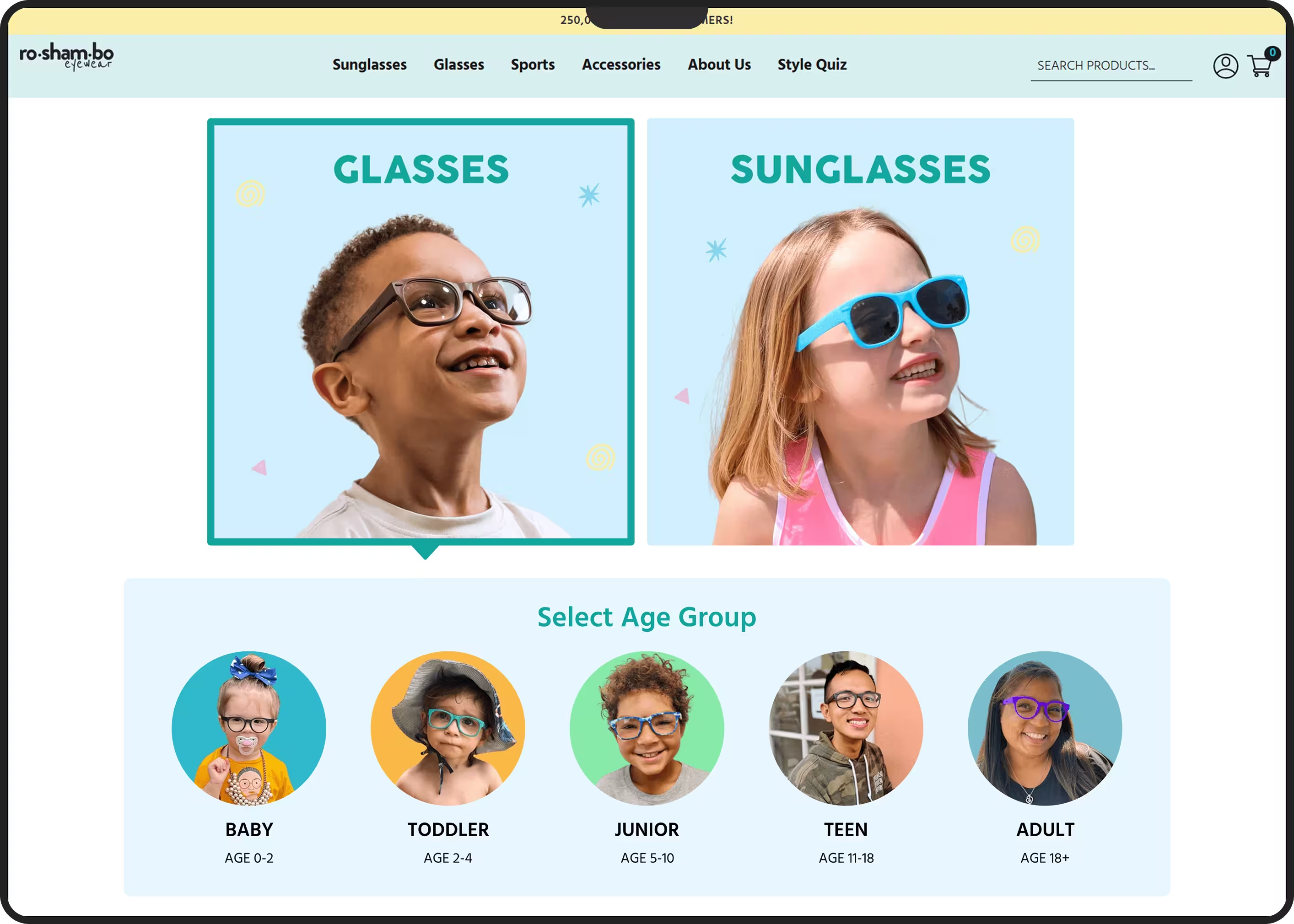
Experiment 1: Navigation was restructured with tiered category tiles, enabling quicker access to product types and age-based subcategories.
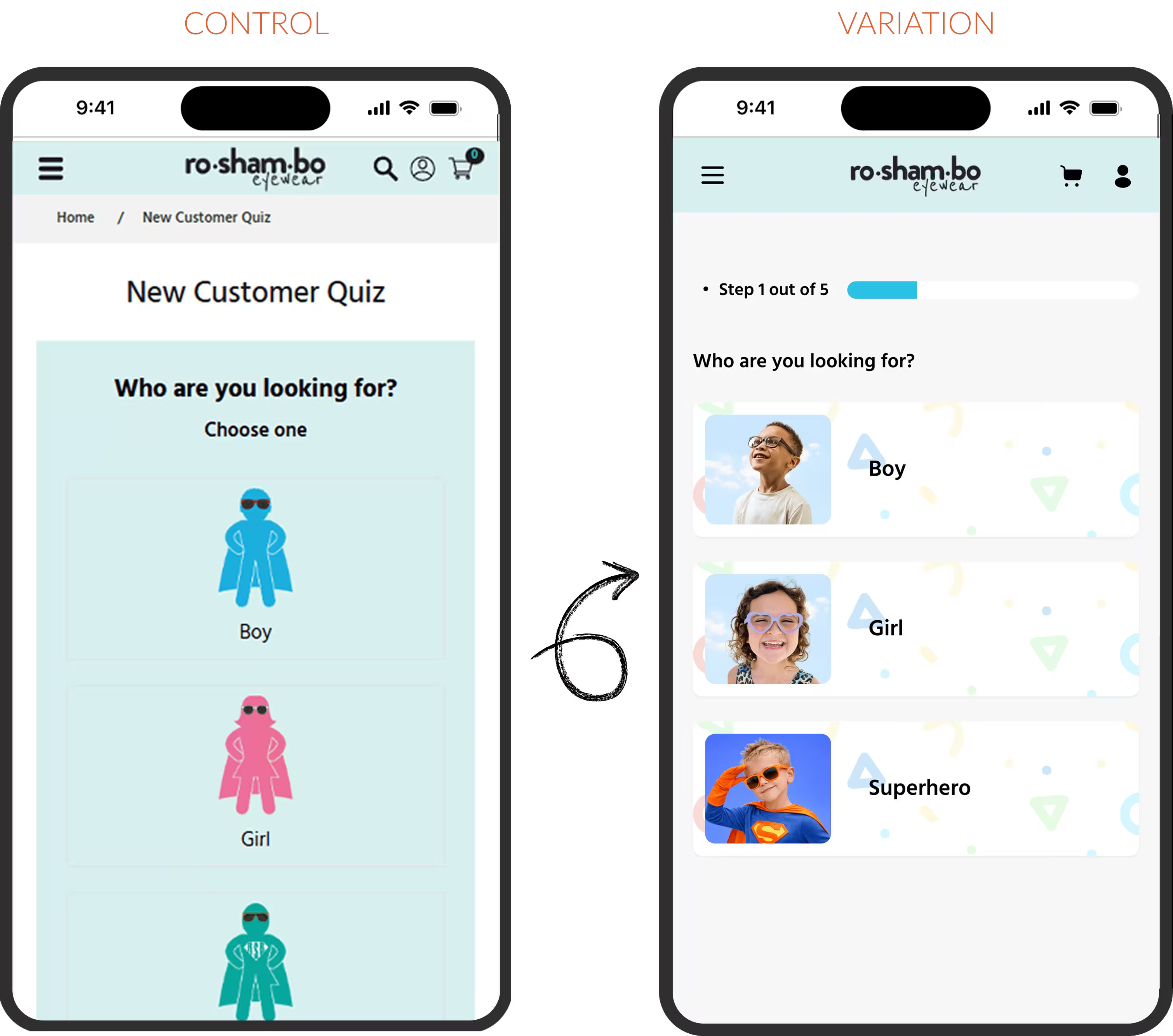
Experiment 2: The quiz was revamped into a prominent, image-led shopping concierge, simplifying discovery and guiding users to relevant products.
Using the AI powered variant builder, the team was able to put together variants for each experiment with just a couple of prompts. Once the variants were built, AI assist recommended the appropriate configuration and metrics to be tracked.
01: Category Tile Revamp
Problem: The navigation relied on large banners and excessive scrolling, making it difficult for users to reach relevant subcategories quickly.
Hypothesis: If users first choose between eyeglasses and sunglasses, followed by quick access to age-based subcategories, they will reach relevant products faster.
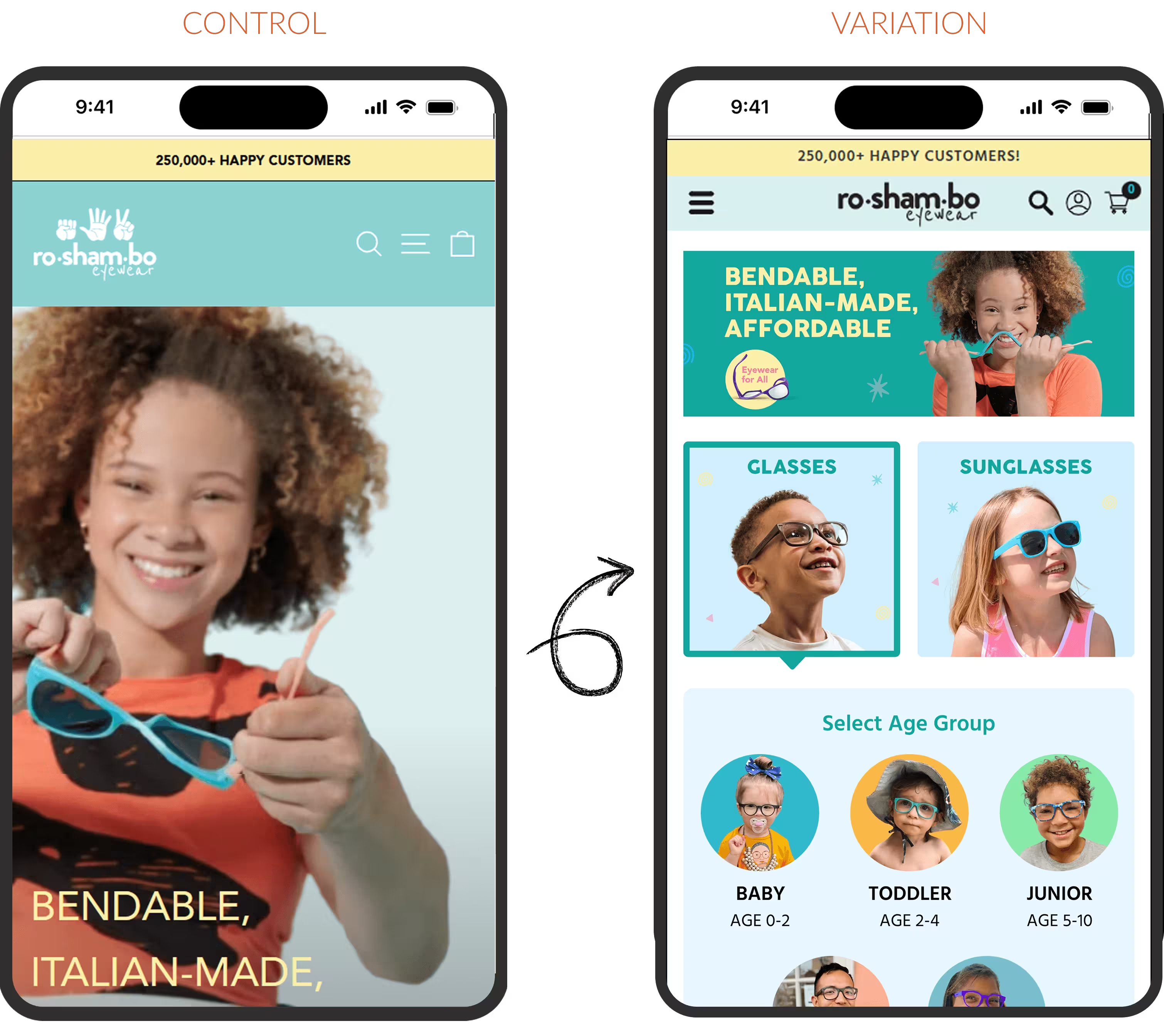
Prompt used to build the variant:
Reduce the height of the top nav bar - make the logo smaller, move the hamburger menu icon to the left, and keep search and cart icons on the right.
Remove the full height hero image and its shop now button, and replace it with the banner image attached. [image of the updated banner was attached in the chat]. The banner should take up 1/3rd of the viewport height. Keep some padding around the banner. Clicking on the banner should have the same target URL as the show now button.
Make the 3 icon banner (below the current hero image) smaller in height. Drop icon sizes if needed
+12.13%
Increase in Conversion Rate
+13.98%
Rise in Revenue Per Visitor
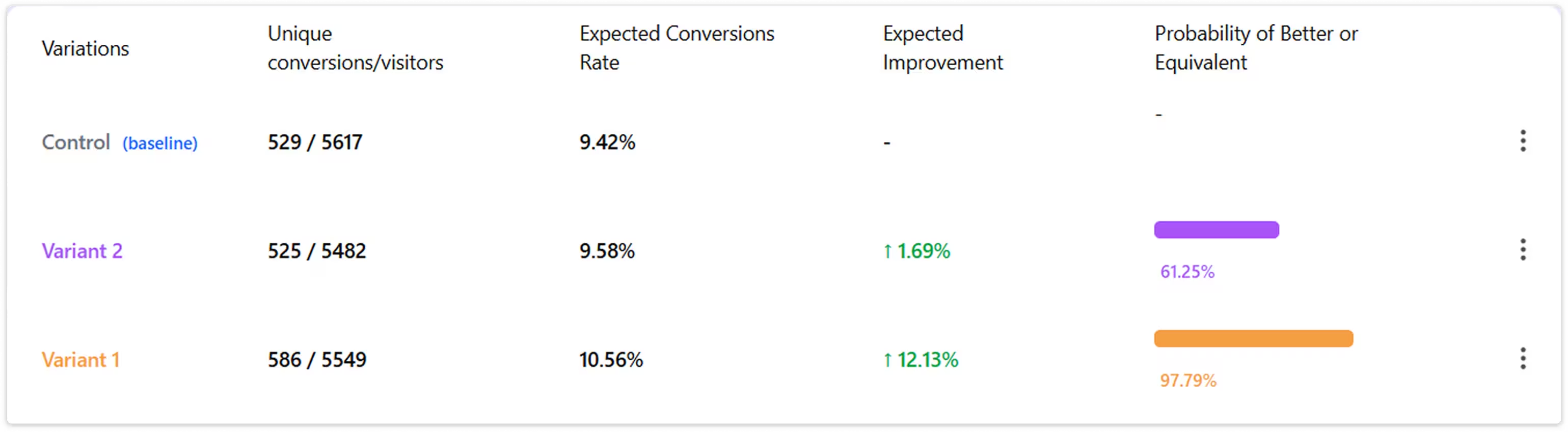
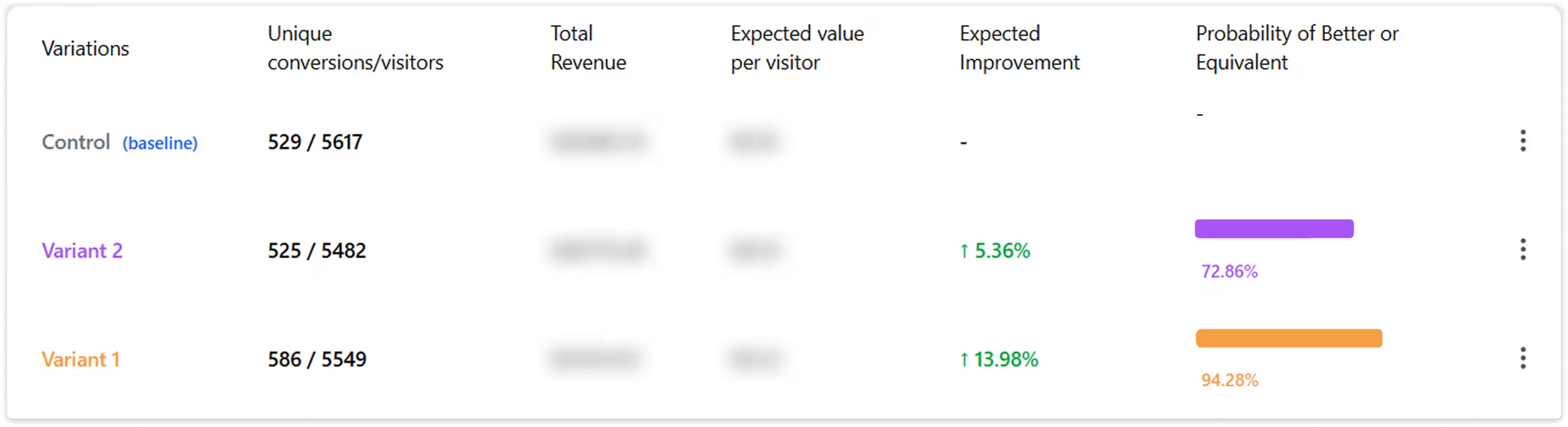
By reducing the number of steps required to reach relevant categories, users were able to navigate with greater clarity and speed. This directly improved discovery efficiency and increased purchase intent.
02: Quiz Revamp
Stage: Discovery/ Mid Funnel
Device: Mobile
Problem: The quiz prioritized data capture over user guidance, lacked visibility and was not engaging, leading to drop-offs and weak product discovery.
Hypothesis: If the quiz is redesigned as a prominent, image-led shopping concierge with a simplified flow and delayed email capture, users will engage more and convert better through guided discovery.
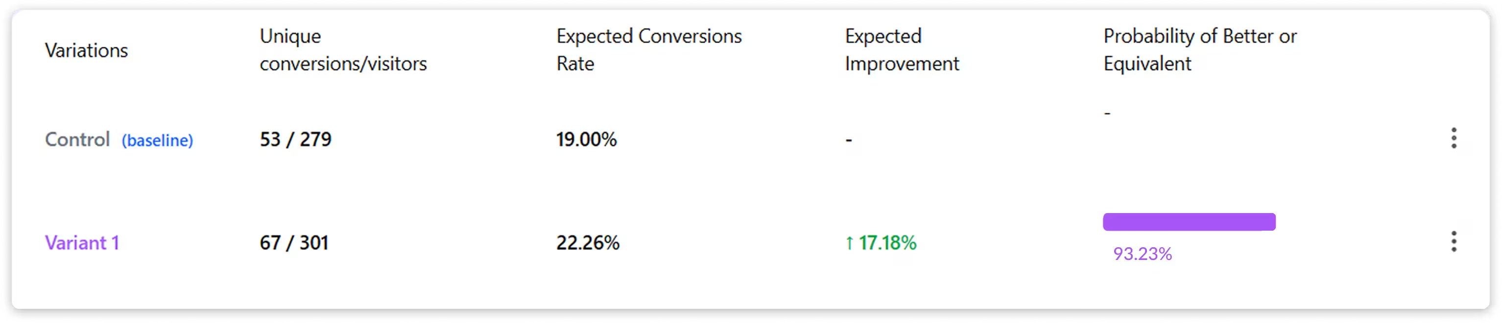
+17.18%
Growth in Conversion Rate
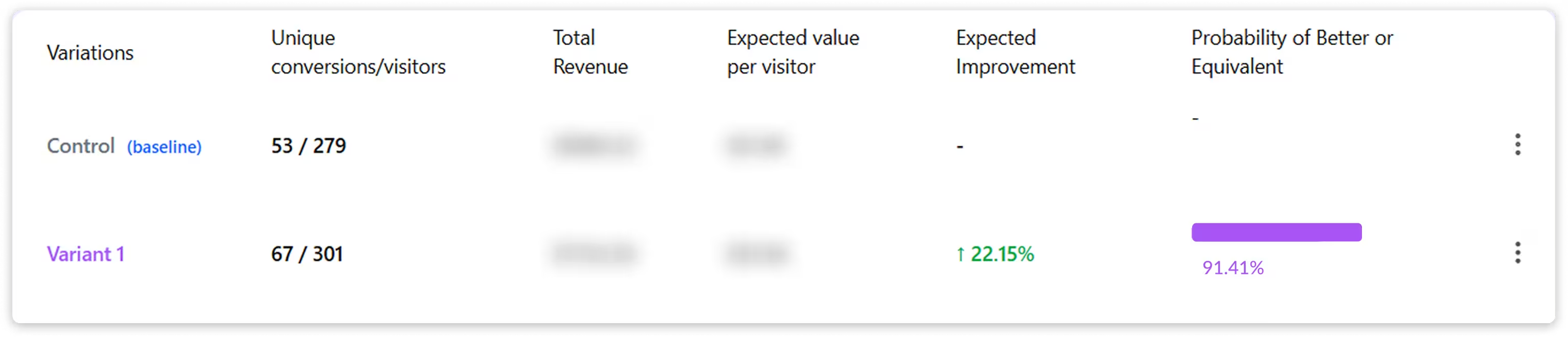
+22.15%
Rise in Revenue Per Visitor
By repositioning the quiz as a low-friction guide instead of a data capture tool, user engagement and confidence improved, reducing decision fatigue and driving stronger early conversions.
Overall Impact
By reducing friction across key discovery touchpoints, Roshambo transformed navigation and product exploration into high-impact conversion drivers. Streamlined category access enabled faster product discovery, while the revamped quiz guided users toward relevant choices with greater confidence.
Together, these improvements reduced decision effort, increased engagement, and drove stronger conversion performance across the funnel.
Recent Case Studies
Growth stories backed by real data.
Better Product Discovery helped DeoDap achieve 68.39% Growth in Revenue
DeoDap is one of India’s largest ecommerce platforms offering over 17,000 products across categories including Home & Living, Kitchen, Tech & Gadgets, Beauty, Fashion, Toys, Office Supplies, and more, with a strong focus on affordable everyday products.
MyRivaaz Increased Add-to-Cart Rate by 100.79% Through Better Navigation and Collection Discovery
MyRivaaz is an online Indian and Pakistani jewelry store based in Maryland, USA, offering bridal, festive, and occasion-based jewelry across categories such as necklaces, earrings, bangles, rings, maang tikkas, and wedding sets.
Beyond By Vera Increased Conversions by 52.83% Through Strategic Cart & PDP Optimizations
Beyond By Vera is a premium fashion and lifestyle brand offering contemporary apparel designed for modern women. With a strong focus on quality, style, and a seamless online shopping experience, the brand attracts customers looking for elevated everyday fashion.